Graphic Design · October 2025
Communauto
A self-directed visual identity concept for the car-sharing service Communauto, built for clarity and everyday use rather than novelty.
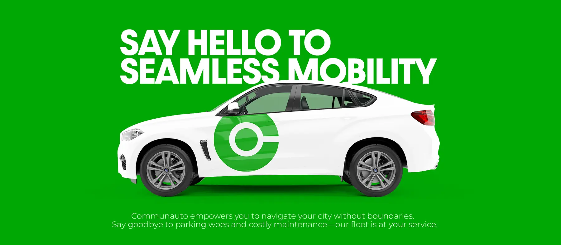
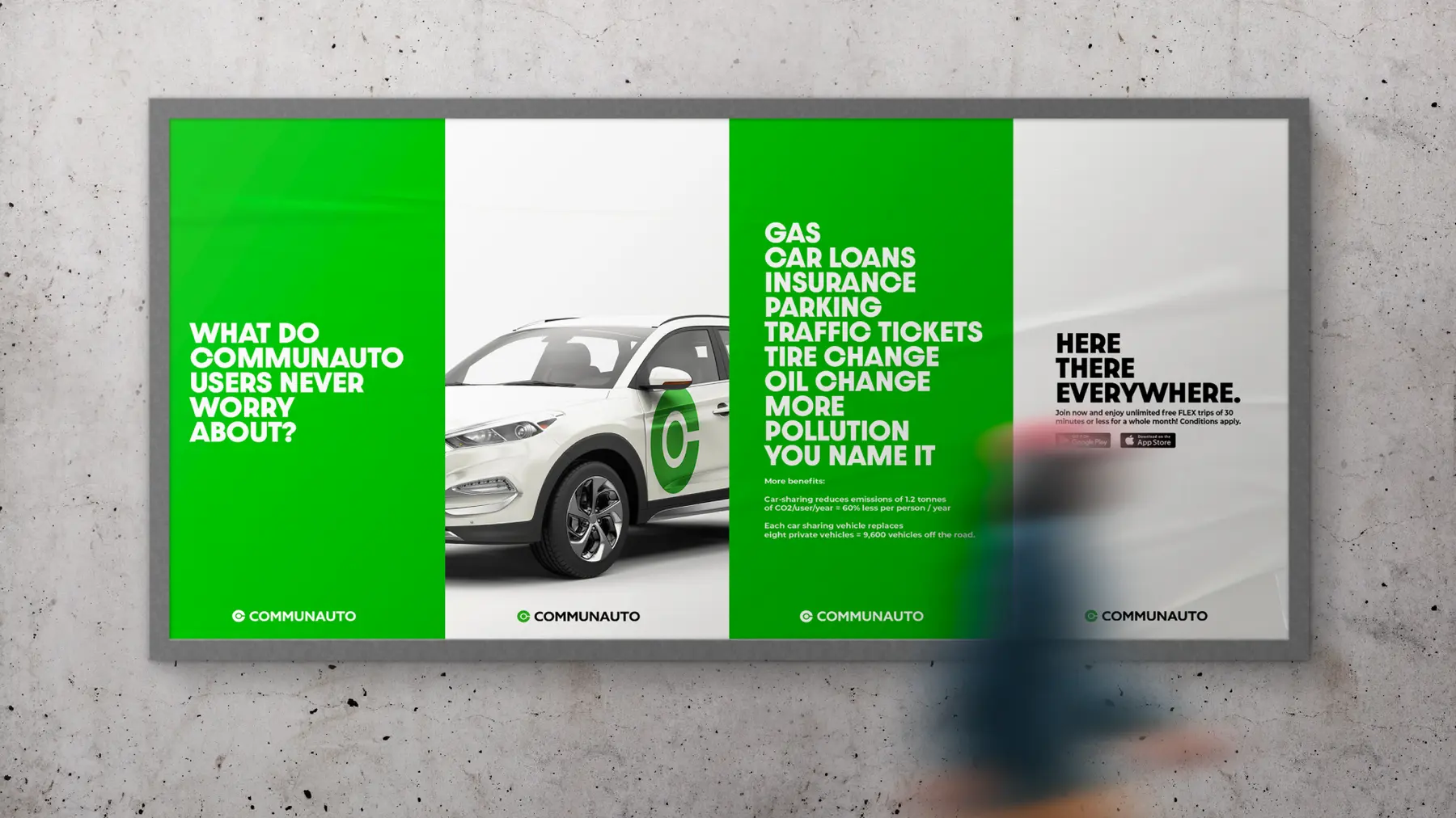
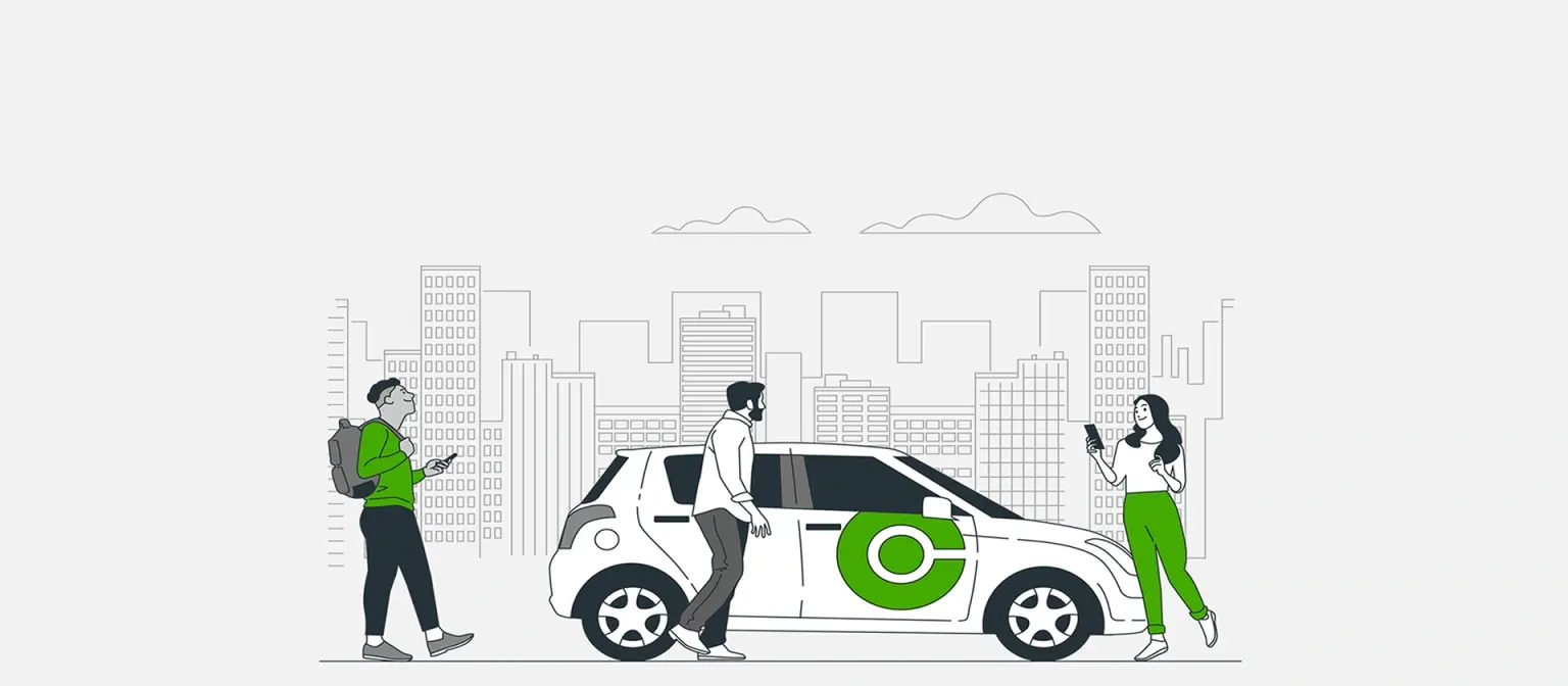
This is a self-directed concept, not a commissioned project: nobody at Communauto asked for it, and nobody there has seen it. The brief I set myself was a circular C mark simple enough to read from across a bus shelter, built to hold up across app icons, rear-window decals, and a two-story building billboard without breaking. I kept the palette to Communauto’s green and white throughout, so the mark reads the same at every scale it gets used at.
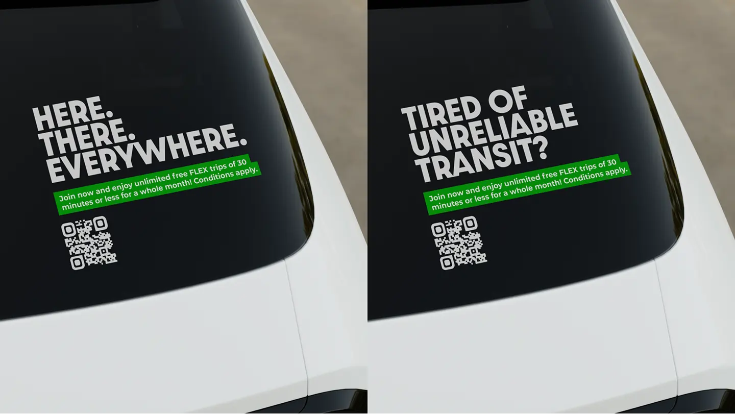
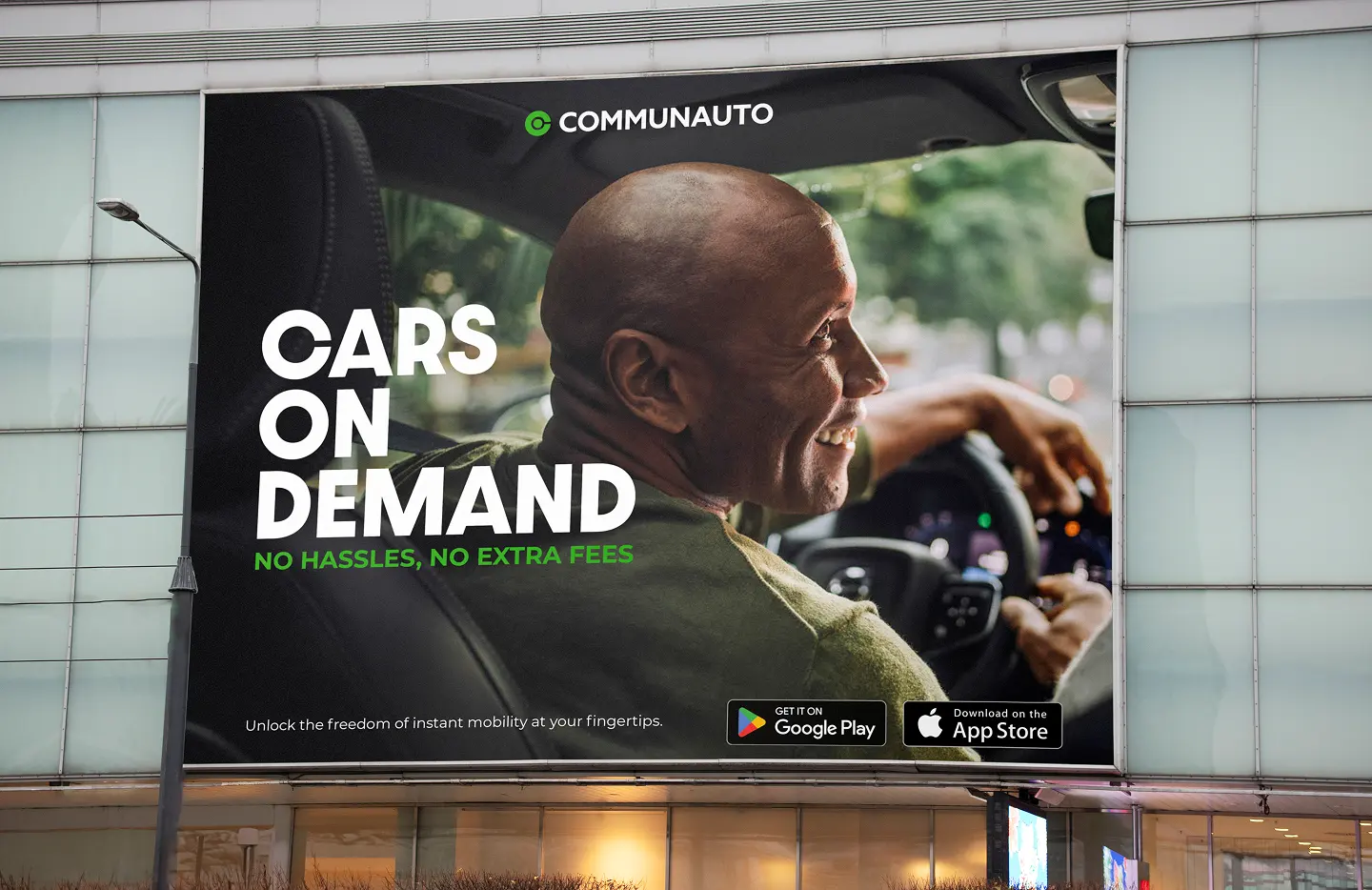
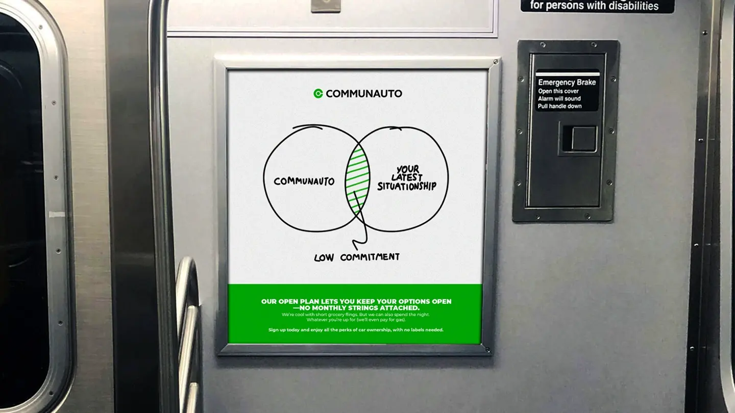
I carried the system into speculative placements: rear-window decals reading “Here There Everywhere” and “Tired of Unreliable Transit,” a billboard promising “No Hassles, No Extra Fees” over a photo of a driver, and a four-panel bus shelter series splitting the pitch across app features, cost, and car availability. Car-sharing already cuts vehicle ownership, household costs, and emissions while nudging people toward walking, cycling, and transit, a case the City of Toronto backs directly, so the mockups argue that math instead of running lifestyle photography.
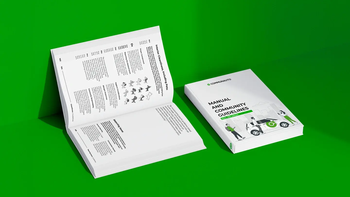
I also mocked up a rebuilt brand guidelines book, imagining what a clearer layout could look like next to the dry reference PDF Communauto actually uses.
Want an identity built to hold up in daily use rather than a pitch deck? Get in touch.