Graphic Design · April 2026
Freja
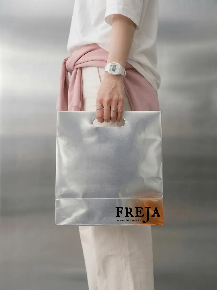
A pro bono brand identity for Freja, a Stockholm skincare line built on restraint, minimal claims, and quiet Scandinavian design.
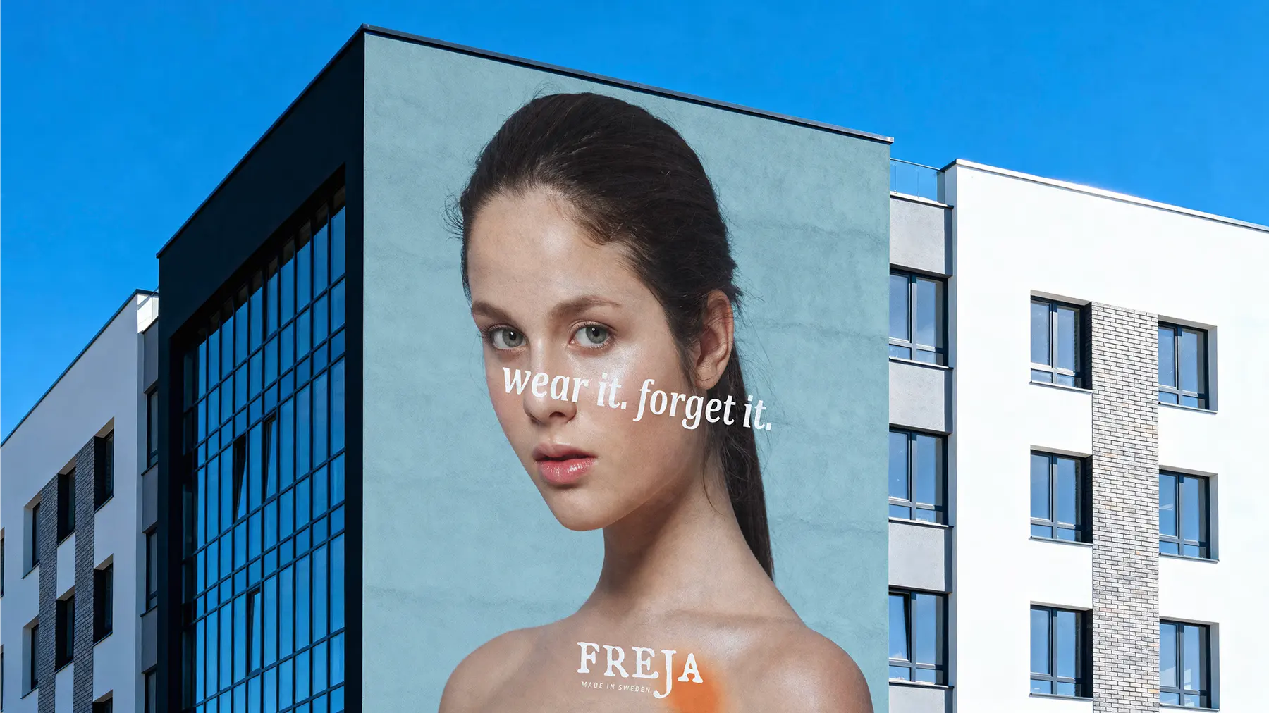
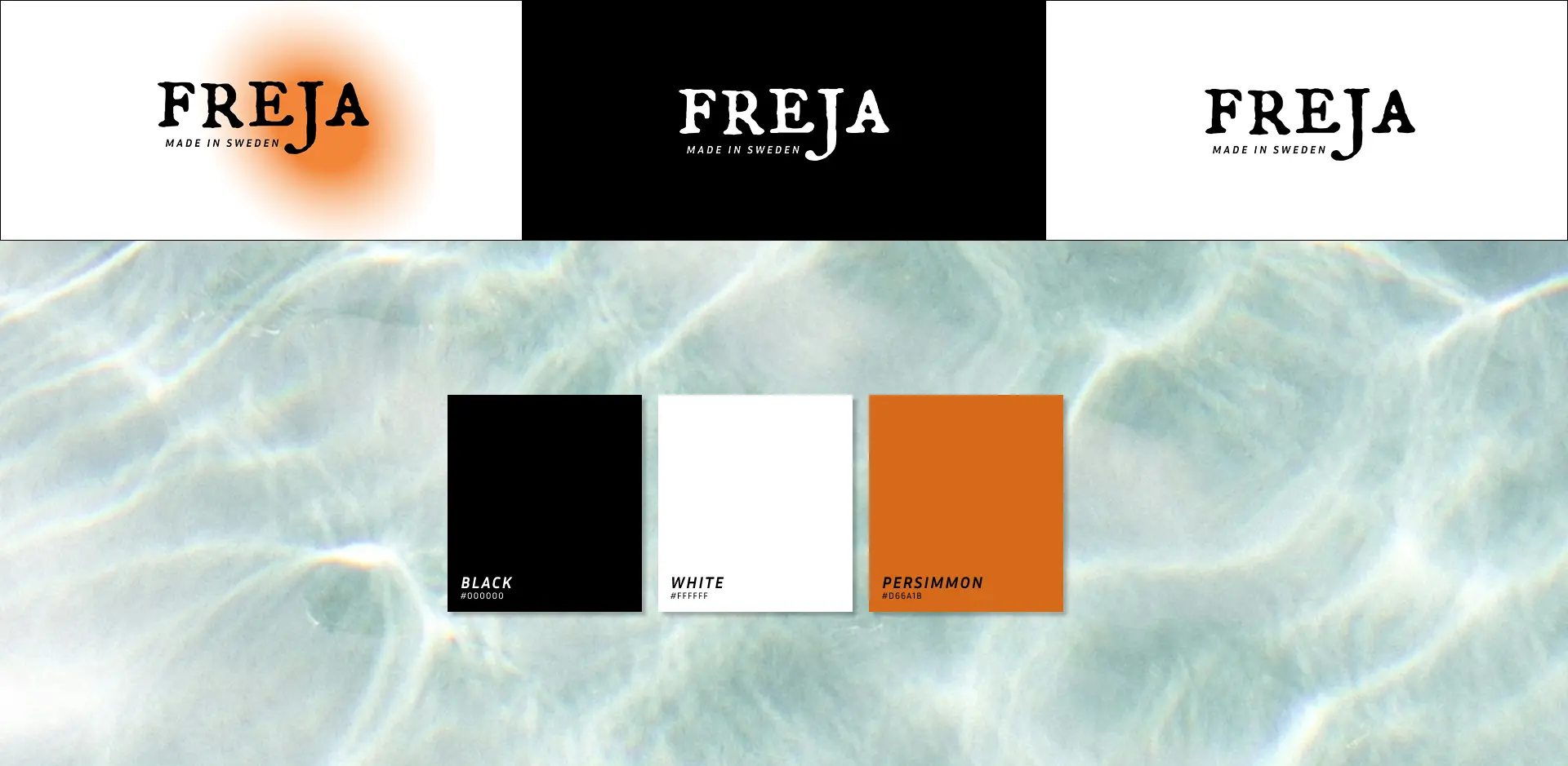
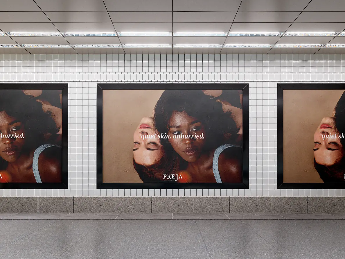
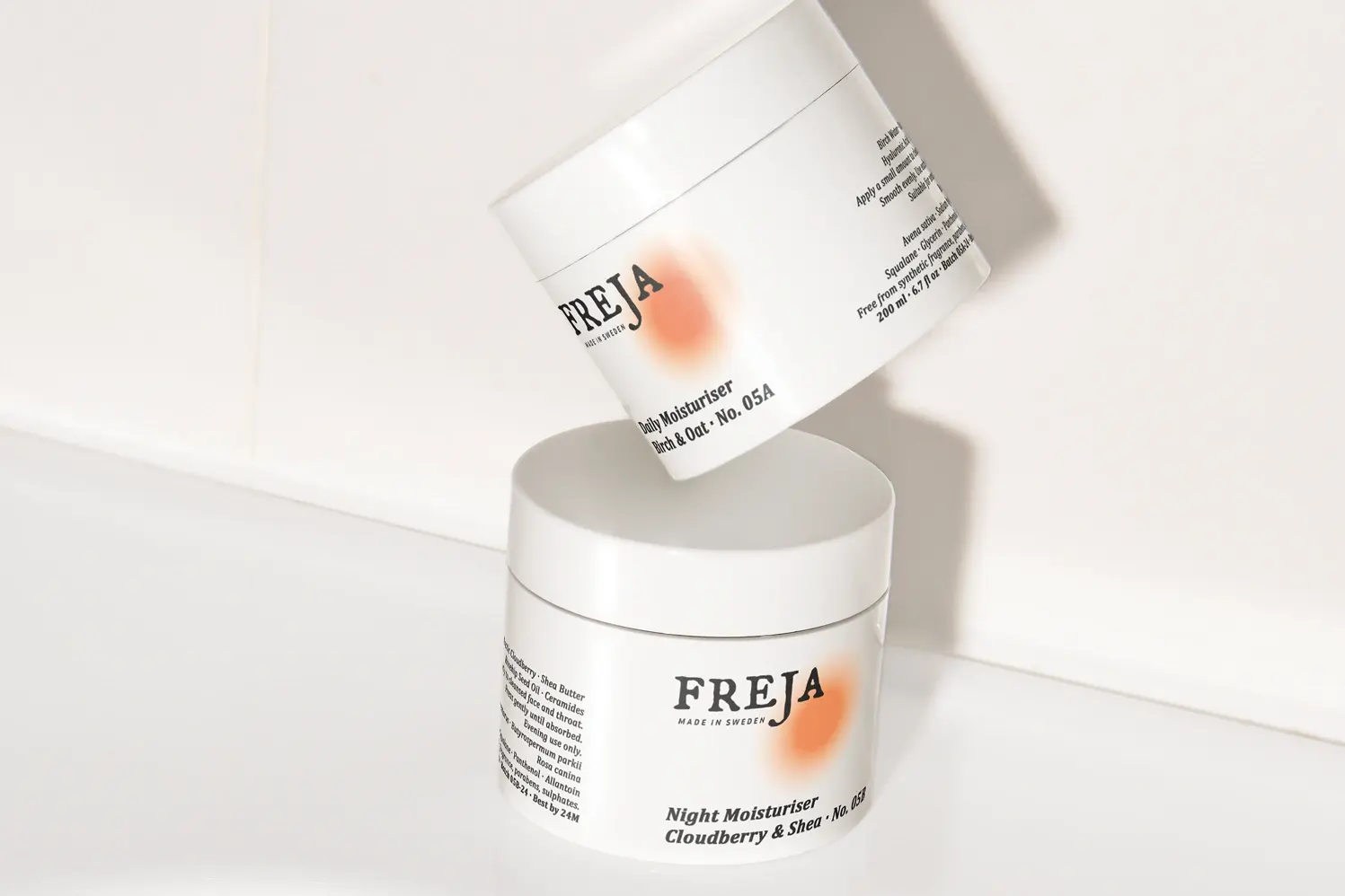
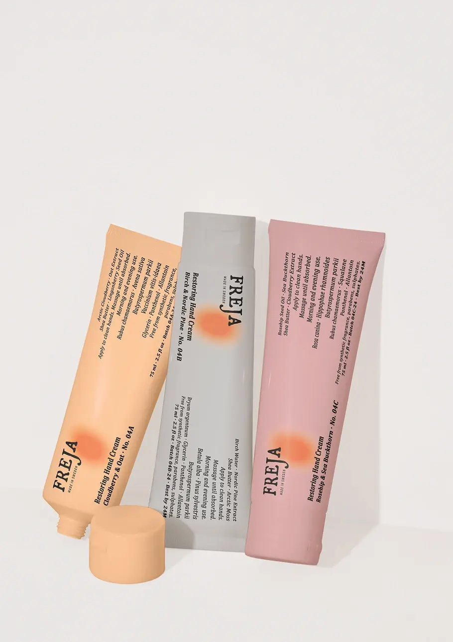
I built Freja on the belief that effective skincare should be honest, minimal, and quietly beautiful. The visual language stays close to that promise: a strict black-and-white base, clean Swiss-influenced typography, and generous negative space, broken only by a warm, diffused orange gradient bleeding softly at the edges, a nod to the low amber light of a Swedish winter afternoon. I wanted the result to sit somewhere between Aesop and the Nordic tundra, unhurried and considered, but affordable enough to live with daily.
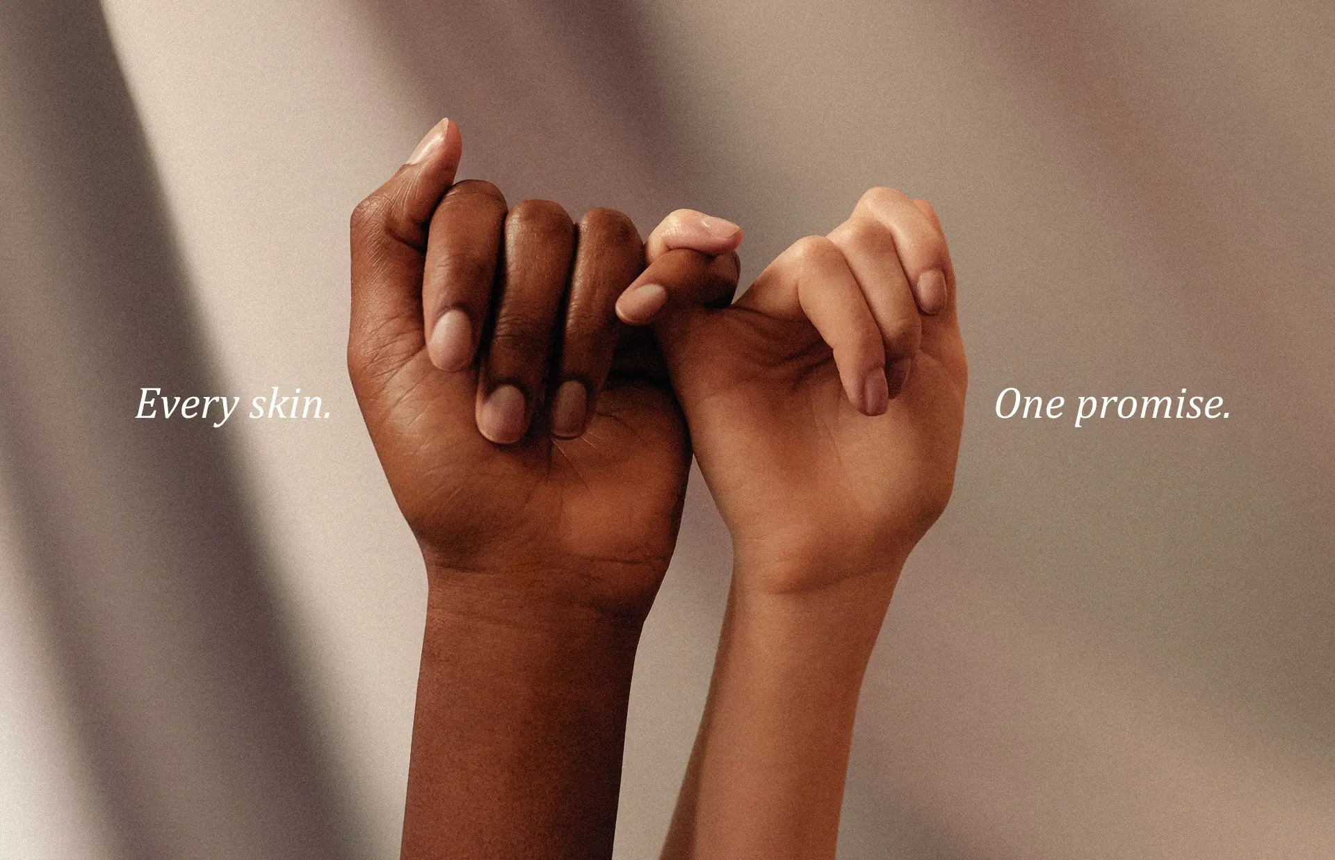
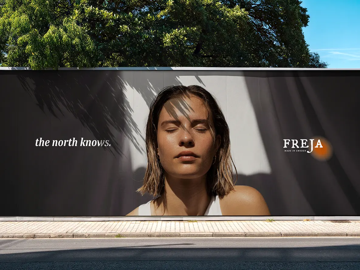
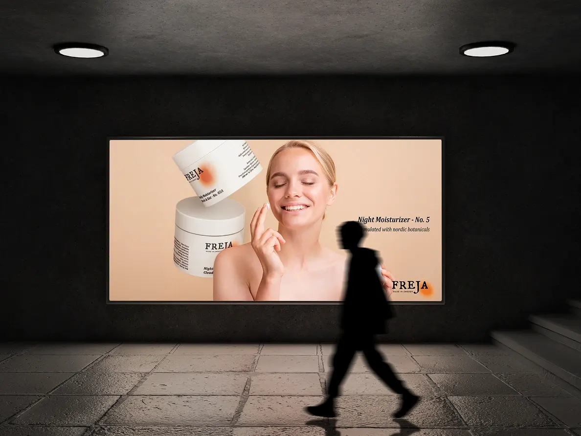
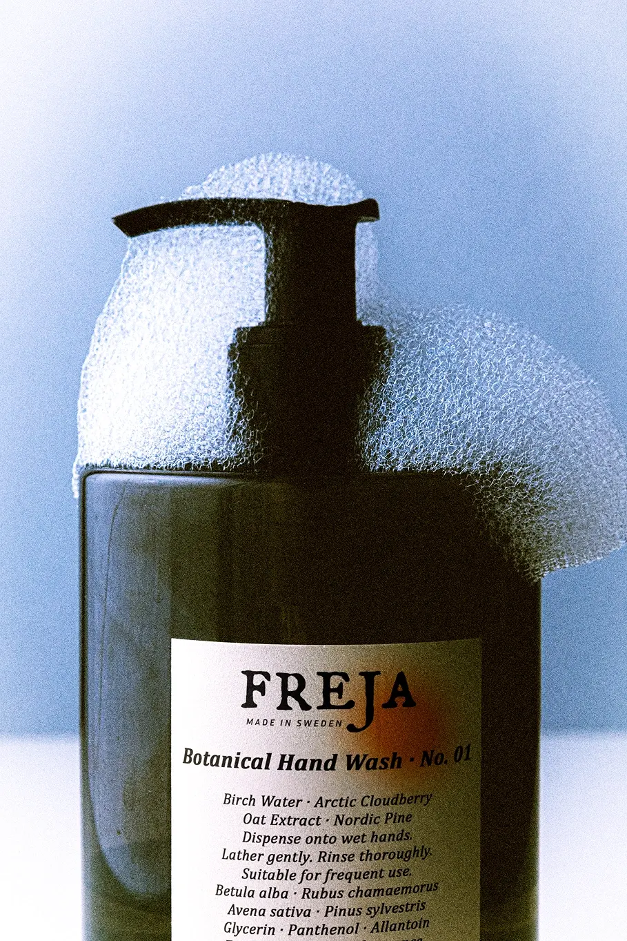
Packaging strips away anything that doesn’t earn its place: matte white vessels, minimal type, and a single amber gradient pressed into the shoulder of each bottle, built to wait rather than compete on a crowded shelf. Campaign imagery skips transformation promises for consistency instead, no models, no before-and-after, just surfaces, texture, and morning routines shot in natural Stockholm winter light. The digital experience follows the same discipline: nothing loads that doesn’t need to, full-bleed silence, a slow scroll, and type that breathes.
Want something this quiet built around what you’re launching? Get in touch.